


You’re sitting on a goldmine of opportunity when you work with corporate brands in New York right now. The city’s pace has finally caught up with its online presence, and corporate sites are no longer just static “about us” brochures. They’re sales tools, reputation builders, and quiet deal closers that work while the boardroom lights are off.
New York web design companies understand how to turn complex offers, demanding stakeholders, and skeptical buyers into a clear, confident online story that feels natural to use and easy to trust. Let’s learn more.
Why New York Sets the Standard
You already know New York doesn’t do “average.” Corporate buyers here expect clarity, speed, and polish from the first second a page loads. They don’t have time for cluttered layouts, confusing menus, or vague copy.
This is why minimal, confident design has become such a strong trend. Clean grids, plenty of white space, and sharp typography signal that a company is organized and serious. Add in a calm color palette and thoughtful hierarchy, and you get a site that feels more like a well-run meeting than a noisy trade show.
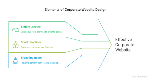
- Minimal Design, Maximum Authority
Corporate visitors do not arrive on a site hoping for surprises. They want answers, proof, and next steps. Modern New York corporate sites give them exactly that with:
- Simple, linear layouts that guide the eye from main promise to proof to action.
- Short headlines that speak to outcomes, not features.
- Enough breathing room around content so nothing feels cramped or desperate.
Minimal doesn’t mean empty. It means intentional. When every element earns its place, your client’s brand comes across as calm, prepared, and in control. That tone matters when the people reading the site make multimillion-dollar decisions.
You can still add personality, but do it with details: a subtle accent color, a single strong typeface pairing, or a distinctive grid that runs through the entire site.
- Storytelling Like an Investor Deck
Corporate sites in New York are starting to look and read a lot like investor decks, and that’s a good thing. Instead of random sections stitched together, the strongest sites follow a simple story arc:
- What the company does and who it serves.
- Why that matters right now.
- How it works in practice.
- Proof that it works.
- Clear ways to move forward.
On the homepage, this story should unfold without forcing visitors to hunt. Lead with a bold, clear line that states the value. Follow it with a short subhead that gives context. Then use a tight grid to introduce services, sectors, or solutions.
Think of each scroll as a slide. Each “slide” should make one point and support it with visuals, data, or a short case study. If a section can’t answer “so what?” in one sentence, it probably needs to be rewritten or removed.
- Credibility as a Design System
In the corporate world, trust is as much a feeling as a requirement. Your design choices either support that trust or quietly chip away at it.
Right now, leading sites build credibility into their design system by making contact details and office locations easy to find, displaying certifications, compliance badges, and key partnerships without turning the page into a NASCAR suit, and featuring case studies that show specific outcomes, timelines, and sectors.
The small bits of text around forms, footers, and CTAs are often where risk-averse users look for reassurance. Clear privacy wording, honest expectations (“24-hour response,” not “instant”), and human-friendly language go a long way.
Everything on the page should say, “You can trust us with important decisions,” even before the first call.
- Enterprise-Grade UX
Corporate buyers in New York are used to serious software, strict procurement processes, and long decision cycles. The site experience should match that reality.
Forms deserve special attention. Instead of leaving long, aggressive fields on first contact, break the process into simple steps. Start with essentials, then ask for more information once the user understands what they gain by sharing it.
Accessibility is part of UX as well, not a bolt-on. Well-structured headings, proper contrast, and keyboard-friendly components don’t just keep legal teams comfortable. They make the experience smoother for everyone.
- Copy That Sounds Human
Design alone won’t save stiff, vague copy. The most effective corporate sites pair sharp visuals with language that sounds like a clear conversation, not a legal document.
A few rules that tend to work:
- Speak directly to the reader: “you,” “your team,” “your clients.”
- Use verbs that describe real actions: “build,” “launch,” “secure,” “support.”
- Cut filler phrases and tired buzzwords wherever you find them.
Even in risk-averse industries, plain language wins. When executives can understand a page in one quick scan, they’re far more likely to share it internally, refer back to it, and act on it.
- Checklists for Corporate-Ready Sites
If you want a quick way to pressure-test a corporate project against current New York expectations, run it through a short checklist like this:
- Does the homepage tell a clear story in under 10 seconds?
- Can a new visitor see what the company does, who it helps, and how to get started without scrolling back and forth?
- Are key trust elements (offices, clients, certifications, and case studies) present but not overwhelming?
- Is the navigation obvious even to someone outside the company?
- Do all interactive elements work smoothly on mobile and desktop?
- Is the copy free of fluff and written in natural, direct language?
If you start to hesitate on any of these, you’ve just found your next round of design work.
Bringing It All Together
New York corporate web design today is more about discipline than chasing the wildest trend. Clean structure, confident typography, purposeful motion, and human language come together to create sites that feel as serious as a board meeting and as simple as a good conversation.
When you treat every layout decision, every headline, and every interaction as part of a larger trust-building system, you stop making “just another corporate site.” You start building a digital presence that suits the city it represents: fast, sharp, and quietly powerful.


Discussion about this post