


We live in a world that runs on data from marketing campaigns and school projects to business reports and social media analytics. But data on its own is often overwhelming. Endless numbers and percentages don’t mean much until they’re given form and context. That’s where data visualization steps in transforming complex information into visuals people can actually understand, connect with, and act upon.
In fact, with today’s digital tools, anyone can create graphs online in minutes, turning raw information into sleek, easy-to-digest visuals. Whether you’re a student presenting research, a small business owner tracking growth, or a content creator trying to make your audience care about stats, clear and beautiful graphs make all the difference.
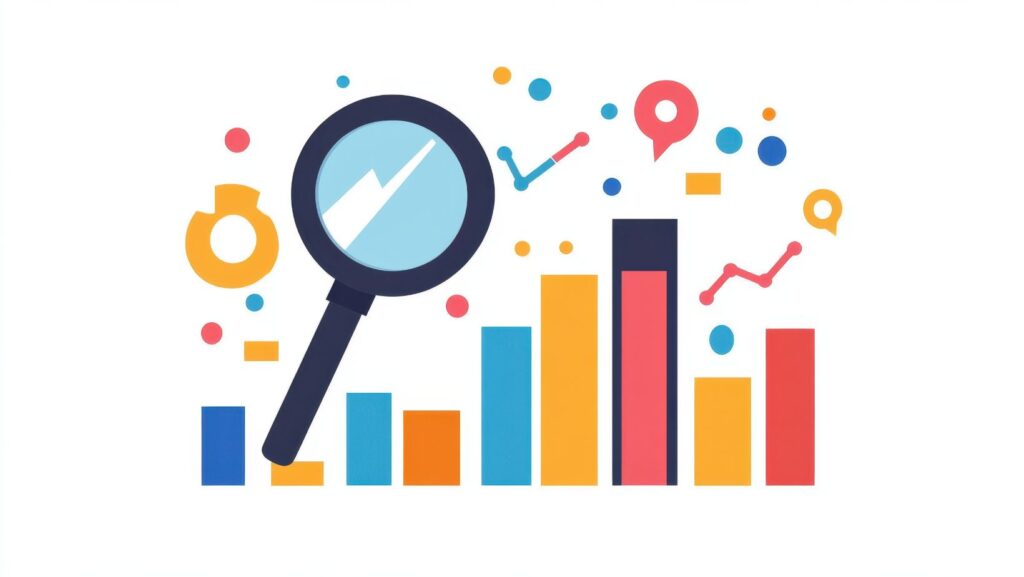
Why Visualizing Data Matters
Humans are visual creatures our brains process images much faster than text. When you show someone a pie chart instead of a list of percentages, you’re not just presenting data; you’re telling a story that clicks instantly.
A well-designed graph can:
- Simplify complexity: It turns dozens of data points into a single, understandable snapshot.
- Enhance engagement: People are more likely to pay attention and remember information presented visually.
- Support better decisions: Clear visuals highlight trends, patterns, and outliers that might otherwise go unnoticed.
Think about a marketing report. Instead of staring at spreadsheets full of numbers, imagine a line graph showing steady growth over the past six months. Suddenly, the story of progress is crystal clear and much more motivating.
Types of Graphs That Tell Powerful Stories
Not every dataset fits into the same visual mold. Choosing the right graph for your goal is key to making your message clear and credible.
1. Line Graphs – Showing Change Over Time
Perfect for tracking growth, trends, or patterns. Use line graphs for metrics like sales growth, temperature variations, or performance over weeks and months.
2. Bar Graphs – Comparing Categories
Ideal when you want to compare different groups or variables. For example, a bar chart showing how each product category performed last quarter makes results instantly understandable.
3. Pie Charts – Breaking Down Proportions
Great for illustrating parts of a whole like market share, survey responses, or budget allocations. Just make sure your categories are limited and distinct; too many slices can confuse rather than clarify.
4. Scatter Plots – Revealing Relationships
When you want to show correlations or patterns between two variables, scatter plots work beautifully. For instance, they can highlight how ad spend relates to website traffic.
Each graph type tells a different kind of story, and choosing wisely ensures your audience sees exactly what you want them to notice.
The Art of Designing Effective Graphs
Making a good graph isn’t just about plugging in numbers it’s about design, clarity, and purpose. Here are some tips professionals swear by:
Keep It Clean
Less is more. Avoid unnecessary 3D effects, cluttered labels, or distracting backgrounds. Simplicity keeps your data the focus.
Use Color Intentionally
Color can emphasize key points or differentiate categories but too many colors can overwhelm. Stick to 2–4 complementary tones for a polished, cohesive look.
Label Everything Clearly
Your graph should be understandable even without explanation. Add titles, axis labels, and legends where necessary to make interpretation effortless.
Stay Consistent
If you’re presenting multiple graphs in a report, use consistent color palettes, fonts, and styles. It creates visual harmony and professionalism.
Real-World Applications of Graphs
Graphs aren’t just for scientists or analysts they’re everywhere:
- Educators use graphs to help students visualize historical trends, population changes, or math concepts.
- Entrepreneurs rely on graphs to track financial progress, customer demographics, and sales forecasts.
- Marketers use visuals to communicate campaign performance and engagement metrics.
- Students include charts in research papers or class presentations to make their findings persuasive.
No matter your field, data visualization turns abstract numbers into actionable insights.
Making Data Beautiful and Accessible
One of the most powerful things about modern graph-making tools is accessibility. You don’t need to be a designer or a statistician to make visuals that look professional. With intuitive platforms available today, creating an effective graph is as simple as entering your data and choosing a design that matches your message.
In minutes, your report can go from dull and text-heavy to clear, visual, and professional the kind of presentation that actually leaves an impression.
Conclusion: Let Your Data Speak
Numbers tell the truth, but visuals make people listen. Whether you’re sharing results, teaching concepts, or presenting insights, good graphs bridge the gap between information and understanding.
The next time you have data worth sharing, don’t just show the numbers tell the story behind them. When done right, a single graph can say more than pages of text ever could.


Discussion about this post