


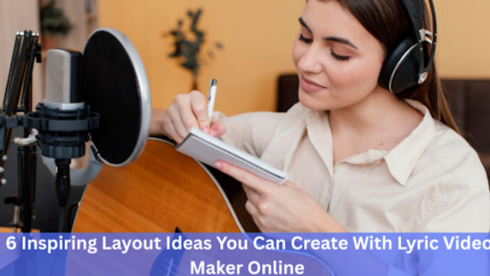
The process of making lyric videos is not always as easy as it sounds. You might have the song prepared, the lyrics written, the concept in your head, but the layout just doesn’t seem to fit in.
There is overlapping of text with visuals, the timing is not right, or the video appears plain. Consequently, the song’s message becomes less effective.
However, the layout does not require complex design skills. It is about choosing a structure that directs attention and helps to sustain the rhythm of the lyrics. Once the layout is effective, your words make more sense, making the video simple to watch.
This article describes practical layouts that you can make using a lyric video maker online and how all of them can be used to present your lyrics in a clean and engaging way.
1. Center-Focused Minimal Layout
One of the simplest methods of ensuring there is clarity is a center-focused layout. In this format, the lyrics are presented in the middle of the screen, and the background is simple and uncomplicated. This layout has the benefit of making sure that, with a lyric video maker, your focus is precisely where it should be – on the words.
This is particularly effective with emotional songs or slow-tempo songs. With the eyes of the viewer staying in the center, reading becomes easy. In addition, the simplicity does not allow distraction by unnecessary visual elements.
In order to have this layout work, the animation should be limited to light effects like fades or gentle motion. Simultaneously, select fonts that can be read with enough spacing. Consequently, every lyric falls at the right place without visual noise.
2. Split-Screen Text and Visual Layout
A split-screen layout can support your song if the song has a powerful mood or theme. In this format, one side of the screen contains images, and the other contains lyrics. This balance makes it possible to coexist between storytelling and readability.
As an example, the left side can include atmospheric clips, whereas the right side can include synchronized text. Since the two elements occupy their own space, they are not competing to be attended to. Rather, they complement each other.
Moreover, this design is effective on social sites where viewers watch at a fast pace. Readability is achieved through clear separation, making the lyrics readable even on a smaller screen. It provides structure to the video without overcrowding when appropriately done.
3. Line-by-Line Progressive Layout

A progressive structure presents a song in a sequential manner, line by line, as the song progresses. Instead of having several lines displayed simultaneously, the lyrics are displayed and vanish with the rhythm. This gives a powerful sense of timing and flow.
This style keeps the listeners in touch with the beat of the song. Because there is a single line shown at a time, the understanding is enhanced automatically. Moreover, it does not allow the viewer to read ahead, and this makes engagement consistent.
In order to enhance this arrangement, have all lines placed consistently. Even minor animation must follow the same way. This regularity creates a visual rhythm that mirrors the music.
4. Background-Driven Layout with Floating Text
In this layout, the background plays a stronger role while lyrics appear as floating overlays. Instead of staying fixed, text moves gently across the frame or fades in different directions.
This structure works well for upbeat or modern tracks. Movement adds energy, while the background supports the song’s tone. Still, control is important.
Excessive motion can reduce readability quickly. Therefore, limit animation speed and keep contrast high between text and background.
When balanced correctly, floating text feels dynamic without becoming overwhelming. As a result, the layout stays expressive while remaining readable.
5. Highlight-and-Emphasis Layout
Not all lyrics carry equal weight. Some lines define the emotion or message of the song. A highlight-based layout brings those moments forward visually.
In this approach, most lyrics appear in a standard style, while key lines receive visual emphasis through size, color, or placement. This change naturally signals importance to the viewer.
Because of this, the audience remembers the message more clearly. However, emphasis should remain selective. If everything stands out, nothing does.
Use highlights sparingly and align them with musical peaks or chorus sections for the strongest effect.
6. Vertical Story Layout for Mobile Viewing
With mobile viewing dominating video consumption, vertical layouts have become increasingly relevant. This structure stacks visuals and lyrics from top to bottom, making the video feel natural on smartphones.
In a vertical layout, lyrics often appear in the lower or middle section, where thumbs and interface elements cause fewer distractions. Meanwhile, visuals occupy the remaining space without blocking text.
This format encourages smoother scrolling-style viewing. Additionally, it works well for short-form platforms where attention spans are limited.
By designing specifically for vertical screens, you improve readability and retention without altering the song itself.
Final Thoughts
A strong lyric video does not rely on complex effects. Instead, it depends on structure, timing, and readability. When the layout supports the lyrics, the song communicates more clearly and holds attention longer.
By exploring these six layout ideas, you gain practical ways to shape your visuals without overcomplicating the process. Each layout serves a different purpose, yet all focus on guiding the viewer through the lyrics smoothly.
Ultimately, thoughtful layout choices turn simple text into an engaging visual experience—one that helps your message stay clear from the first line to the last.


Discussion about this post