


Have you ever wanted to add your own custom button to your WYSIWYG editor that instantly inserts your favourite content template?
Maybe a styled callout box, a testimonial card, or a formatted code snippet, whatever you use often. Custom toolbar buttons save you tons of time and help keep your content consistent and clean.
In this guide, I’ll show you how to create custom toolbar buttons in JavaScript-based WYSIWYG editors. I’ll be using Froala Editor’s API for the examples since it makes the process straightforward, but the same idea works in most WYSIWYG editors.
By the end, you’ll be able to add your own custom buttons that insert nicely formatted content blocks with just a single click.
— Evan (@itsEvanCC) October 19, 2025
Key Takeaways
- Custom toolbar buttons let you insert reusable content templates with just one click.
- Froala’s custom button API makes it very easy to extend the editor’s functionality.
- You can insert HTML content dynamically using the editor’s insertion methods.
- Custom buttons help you work faster and keep your content design consistent.
- You only need basic JavaScript to build these, nothing too advanced.
Now that you know what we’ll be covering, let’s start with the basics: what exactly are custom toolbar buttons?
What Are Custom Toolbar Buttons?
Custom toolbar buttons are basically extra buttons you can add to your editor that do exactly what you need.
Instead of typing or pasting the same HTML again and again, you just click a button and it appears automatically.
Think of them as shortcuts for your most-used content blocks, like:
- Alert boxes or callouts
- Testimonial cards
- Code snippet containers
- Custom layouts
- Styled information boxes
So now that you know what these buttons do, let’s go ahead and start creating them.
Setting Up Your Editor
Before creating custom buttons, you’ll need a basic Froala Editor setup. Here’s the simplest way to get started:
| <!DOCTYPE html> <html> <head> <meta charset=”utf-8″ /> <title>Custom Toolbar Buttons</title> <!– Froala CSS –> <link href=”<https://cdn.jsdelivr.net/npm/froala-editor@latest/css/froala_editor.pkgd.min.css>” rel=”stylesheet” /> </head> <body> <div id=”editor”></div> <!– Froala JS –> <script src=”<https://cdn.jsdelivr.net/npm/froala-editor@latest/js/froala_editor.pkgd.min.js>”></script> <script> // Initialize the editor new FroalaEditor(“#editor”); </script> </body> </html> |
This gives you a basic editor with all the standard formatting buttons. Now let’s add our custom buttons to it.
Creating a Simple Callout Button
Let’s create a button that inserts a styled callout box. It’s perfect for highlighting important information.
| <script> // Define a custom button icon for the editor toolbar FroalaEditor.DefineIcon(“insertCallout”, { NAME: “💡”, // The emoji that will appear on the button template: “text”, // Use text-based icon }); // Register the custom button and define its behavior FroalaEditor.RegisterCommand(“insertCallout”, { title: “Insert Callout”, // Tooltip text when hovering over the button focus: true, // Keep the editor focused after clicking undo: true, // Enable undo for this action refreshAfterCallback: true, // Refresh toolbar after insertion // Function that runs when the button is clicked callback: function () { // HTML content to insert into the editor var calloutHTML = ` <div style=”background-color: #e3f2fd; border-left: 4px solid #2196f3; padding: 15px; margin: 15px 0; border-radius: 4px;”> <strong>💡 Important:</strong> Add your message here </div> <p><br></p> `; // Insert the HTML content at the current cursor position this.html.insert(calloutHTML); }, }); // Initialize the Froala Editor and include the custom button in the toolbar new FroalaEditor(“#editor”, { toolbarButtons: [“bold”, “italic”, “|”, “insertCallout”], }); </script> |
What this code does:
- DefineIcon creates the button’s visual appearance (💡 here).
- RegisterCommand defines what happens when the button is clicked.
- callback function contains the logic for inserting the callout box.
- this.html.insert() adds the HTML at the cursor position.
- Initialising FroalaEditor with the button adds it to the toolbar alongside default formatting options.

Creating a Testimonial Card Button
Now, let’s create a testimonial card with a quote, the author, and their company.
| <script> // Define a custom button icon for the editor toolbar FroalaEditor.DefineIcon(“insertTestimonial”, { NAME: “💬”, // The emoji that appears on the button template: “text”, // Use a text-based icon }); // Register the custom button and define its behavior FroalaEditor.RegisterCommand(“insertTestimonial”, { title: “Insert Testimonial”, // Tooltip text on hover focus: true, // Keep editor focused after click undo: true, // Enable undo for this action refreshAfterCallback: true, // Refresh toolbar after insertion // Function that runs when the button is clicked callback: function () { // HTML content for the testimonial card var testimonialHTML = ` <div style=”background-color: #f9f9f9; border: 1px solid #ddd; padding: 20px; margin: 20px 0; border-radius: 8px;”> <p style=”font-style: italic; font-size: 16px; margin: 0 0 15px 0;”> “This is an amazing product! It has completely transformed how we work.” </p> <div style=”display: flex; align-items: center; gap: 10px;”> <div style=”width: 50px; height: 50px; background-color: #ccc; border-radius: 50%;”> <img src=”<https://encrypted-tbn0.gstatic.com/images?q=tbn:ANd9GcTpnd63pzTs_uaC9d2Kf8Fds5eDXPFn29fWVQ&s>” alt=”John Doe” style=”width: 50px; height: 50px; border-radius: 50%;”></div> <div> <strong>John Doe</strong><br> <span style=”color: #666; font-size: 14px;”>CEO, Company Name</span> </div> </div> </div> <p><br></p> `; // Insert the testimonial card HTML at the current cursor position this.html.insert(testimonialHTML); }, }); // Initialize the Froala Editor with the custom button added to the toolbar new FroalaEditor(“#editor”, { toolbarButtons: [“bold”, “italic”, “|”, “insertTestimonial”], }); </script> |
What this code does:
- DefineIcon creates a custom toolbar button with a 💬emoji.
- RegisterCommand sets what happens when the button is clicked.
- callback contains the logic for inserting a testimonial card.
- this.html.insert() adds the testimonial HTML at the current cursor position.
- Initialising FroalaEditor with toolbarButtons adds the custom button to the editor toolbar.
- Users can click the button and then customise the placeholder text with their actual testimonial content.

Code Snippet Container
If you’re creating technical docs, a button to insert code snippets can be a real time-saver:
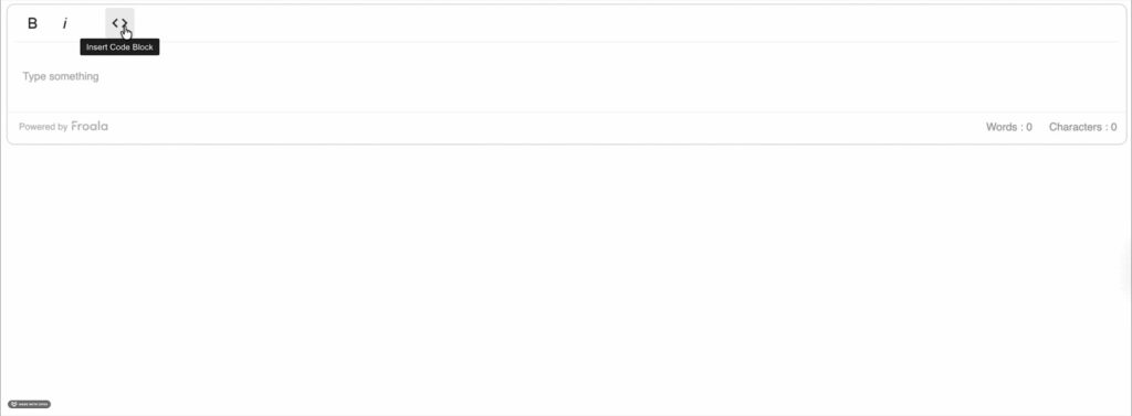
| <script> // Define a custom button icon for the Froala toolbar FroalaEditor.DefineIcon(“insertCode”, { NAME: “codeView”, // Icon name (built-in Froala icon) SVG_KEY: “codeView”, // The SVG used for the icon }); // Register the custom button and define its behavior FroalaEditor.RegisterCommand(“insertCode”, { title: “Insert Code Block”, // Tooltip text when hovering over the button focus: true, // Keep editor focused after clicking undo: true, // Enable undo for this action refreshAfterCallback: true, // Refresh toolbar after insertion // Function executed when the button is clicked callback: function () { // HTML content for the code block var codeHTML = ` <div style=”background-color: #282c34; color: #abb2bf; padding: 20px; margin: 15px 0; border-radius: 6px; font-family: ‘Courier New’, monospace; overflow-x: auto;”> <div style=”color: #888; font-size: 12px; margin-bottom: 10px;”>JavaScript</div> <pre style=”margin: 0; color: #abb2bf;”><code>function greet(name) { console.log(‘Hello, ‘ + name + ‘!’); } greet(‘World’);</code></pre> </div> <p><br></p> `; // Insert the code block at the current cursor position this.html.insert(codeHTML); }, }); // Initialize Froala Editor and include the custom button in the toolbar new FroalaEditor(“#editor”, { toolbarButtons: [“bold”, “italic”, “|”, “insertCode”], }); </script> |
What this code does:
- DefineIcon creates a custom toolbar button using Froala’s built-in codeView icon.
- RegisterCommand sets what happens when the button is clicked.
- callback contains the logic to insert a styled code block with a language label and sample code.
- this.html.insert() inserts the code block HTML at the current cursor position.
- Initialising FroalaEditor with toolbarButtons adds the custom Insert Code Block button to the editor.
- Clicking the button creates a dark-themed code block that looks professional and is easy to read.
Best Practices for Creating Custom Buttons
Creating custom buttons isn’t just about adding features, it’s about making the editor easier to use. These tips will help you build buttons that work well and are easy for users to use.
- Keep HTML simple: Use basic inline styles rather than complex CSS classes. This ensures your content looks consistent even if you copy it to other platforms. For more tips, check out practices for WYSIWYG editors.
- Add breathing room: Always add a paragraph break (<p><br></p>) after your inserted content so users can easily keep typing.
- Use semantic HTML: Inline styles are fine for quick templates, but using proper HTML structure makes your content more meaningful and easier to maintain:
| <aside class=”callout”> <strong>Note:</strong> Your content here </aside> |
- Make content editable: Make sure anything you insert can be easily changed. Avoid deeply nested structures that are hard to edit.
- Test undo/redo: Using undo: true option in your button setup lets users easily undo the insertion if needed.
- Provide clear icons: Use icons that clearly show what the button does. Froala has lots of built-in SVG icons you can choose from.
Common Pitfalls to Avoid
Even small mistakes can make custom buttons harder to use or maintain. Here are a few common issues to watch out for when building and testing your buttons.
- Forgetting the callback context: Always use this.html.insert() inside the callback. Here, this points to the editor instance.
- Overly complex HTML: Avoid complex nested divs, they’re tricky to edit and maintain. For advanced layouts, use the editor’s built-in tools.
- Test on mobile: Make sure your buttons and inserted content work well on mobile devices.
- Forgetting toolbar configuration: Remember to add your custom button to the toolbarButtons array, or it won’t show up.
Conclusion
Creating custom toolbar buttons in your WYSIWYG editor is easier than you might think. With just a few lines of JavaScript, you can add buttons that insert nicely formatted content blocks with a single click.
We’ve covered three examples: callouts, testimonials, and code snippets, but you can make buttons for almost anything, like:
- Pricing tables
- FAQ sections
- Image galleries
- Custom forms
- Product showcases
If you want more inspiration, check out Froala’s examples.
The key is to start simple, test your buttons, and add more features as you get comfortable with the API. It will save you lots of time and keep your content looking consistent.
About the Author
Shefali Jangid is a web developer, technical writer, and content creator passionate about building intuitive developer tools and educational resources. She shares tutorials, code snippets, and practical tips on her blog, shefali.dev, helping developers create better web experiences with clean, efficient, and accessible code.


Discussion about this post